

What is Flexbox?
A Flexbox is a one-dimensional layout model to arrange items in a container. Before introducing the flex property, developers use float or positioning properties to align items in CSS. This results in so much difficulty to arrange elements and takes lots of code. Flexbox provides an efficient way to lay out items in just a few lines of code. Flexbox property gives the flexibility to arrange elements and distribute space between them. The main aim of Flexbox is to accommodate elements in the available free space of the container. It will also shrink elements to prevent overflow.
The flex model
The flexbox is not a single property. It contains different things in addition to its entire set of properties. Some of them are placed in the container means the parent element. The parent element is called a 'Flex container'. While others are placed on the children. The children element is called 'Flex items'. In flex property, the elements are laid out along two axes.
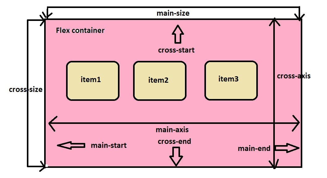
main-axis:
It is the primary axis of the flex container where the flex items are laid out. The direction of flex items is either a row or column that is based on the flex-direction property.
main-start or main-end:
The start point of the main-axis is called main-start and the endpoint is called main-end. The flex items are aligned in the container from main-start to main-end.
main-size:
The height or width of the flex items in the dimension of the main-axis is called the flex item's main-size.
cross-axis:
The perpendicular axis of the main-axis is called the cross-axis. This cross-axis direction is based on the direction of the main-axis.
cross-start or cross-end:
The start point of the cross-axis is called the cross-start and the endpoint is called the cross-end. Flex lines are filled with items and aligned into the container.
main-size:
The height or width of the flex items in the dimension of the cross-axis is called the flex item's cross-size.
Flex container properties
The display property
The flex container becomes flexible by setting the display: flex; property. It enables all the flex properties. The flex container should be inline or block depending on the given value.
Syntax:
element{
display: flex; /* inline-flex; */
}
The flex-direction property
The flex-direction property is used to align the flex items in the specified direction of the flex container. The flex-direction has four values that are row, row-reverse, column and column-reverse.
Syntax:
element{
display: flex;
flex-direction: row; | row-reverse; | column; | column-reverse;
}
row:
By default, the flex-direction contains the row value. The flex-direction: row; align flex items in a horizontal line from left to right in the flex container.
Example:
row-reverse:
The flex-direction: row-reverse; align flex items in a horizontal line from right to left in the flex container.
Example:
column:
The flex-direction: column; align flex items in a vertical line from top to bottom in the flex container.
Example:
column-reverse:
The flex-direction: column-reverse; align flex items in a vertical line from bottom to top in the flex container.
Example:
The flex-wrap property
By default, all the flex items in the container are set to the single line only. By using the flex-wrap properties we can allow flex items to wrap when needed. The flex-wrap has three values that are nowrap, wrap and wrap-reverse.
Syntax:
element{
display: flex;
flex-wrap: nowrap; | wrap; | wrap-reverse;
}
nowrap:
By default, the flex-wrap property contains the nowrap value. The flex-wrap: nowrap; align flex items in a single line in the container which means no wrap.
Example:
wrap:
The flex-wrap: wrap; specifies the flex items to wrap in the container from top to bottom in possible lines.
Example:
wrap-reverse:
The flex-wrap: wrap-reverse; specifies the flex items to wrap in the container from bottom to top in possible lines.
Example:
The flex-flow property
The flex-flow property is a shorthand for the flex-direction and flex-wrap properties. By default, the flex-flow property is set to flex-flow: row nowrap;
Syntax:
element{
flex-flow: row nowrap; | row wrap; | row wrap-reverse; |row-reverse nowrap; | row-reverse wrap; | row-reverse wrap-reverse; | column nowrap; | column wrap; | column wrap-reverse; | column-reverse nowrap; | column-reverse wrap; | column-reverse wrap-reverse;
}
Example:
In the above example, I use flex-flow: column wrap; we can use any other property values also.
The justify-content property
The flex items are arranged in a line, or they might be inflexible, or might be flexible but the allocated space is finished. This problem is solved by the justify-content property. This property aligns flex items along the main axis. It distributes the free space. It has control over the alignment of flex items when they overflow in the line.
The justify-content property has some values:
flex-start:
By default, the justify-content property has the value of flex-start. It helps to align flex items at the beginning of the flex container.
Syntax:
element{
display: flex;
justify-content: flex-start;
}
Example:
flex-end:
The justify-content property of flex-end value helps to align flex items at the end of the flex container.
Syntax:
element{
display: flex;
justify-content: flex-end;
}
Example:
center:
The justify-content property of the value center helps to align flex items at the center of the flex container.
Syntax:
element{
display: flex;
justify-content: center;
}
Example:
space-between:
The justify-content property of the value space-between helps to align space between the flex items of the flex container.
Syntax:
element{
display: flex;
justify-content: space-between;
}
Example:
space-around:
The justify-content property of the value space-around helps to align space around the flex items of the flex container which means space between, before and after the flex items.
Syntax:
element{
display: flex;
justify-content: space-around;
}
Example:
space-evenly:
The justify-content property of the value space-evenly helps to align equal space between the flex items of the flex container which means the space between the flex items is equal.
Syntax:
element{
display: flex;
justify-content: space-evenly;
}
Example:
The align-items property
The align-items property behaves like the justify-content property but it aligns flex items along the cross-axis of the flex container.
The align-items property has some values:
flex-start | start:
The align-items property with the value flex-start or start helps to align flex items at the top of the flex container.
Syntax:
element{
display: flex;
align-items: flex-start; | start;
}
Example:
flex-end | end:
The align-items property with the value flex-end or end helps to align flex items at the bottom of the flex container.
Syntax:
element{
display: flex;
align-items: flex-end; | end;
}
Example:
center:
The align-items property with the value center helps to align flex items at the middle of the flex container.
Syntax:
element{
display: flex;
align-items: center;
}
Example:
stretch:
By default, the align-items property has the value of stretch. The align-items property with the value stretch helps to stretch the flex items to fill the flex container.
Syntax:
element{
display: flex;
align-items: stretch;
}
Example:
baseline:
The align-items property with the value baseline helps to align the flex items to their baseline of the flex container.
Syntax:
element{
display: flex;
align-items: baseline;
}
Example:
The align-content property
The align-content property is used to align the flex container's lines in the cross-axis. The behavior of the align-content property with the flex lines is similar to the justify-content property with the flex items.
The align-content property has some values
flex-start | start:
The align-content property with the value of flex-start or start helps to align flex lines at the start of the flex container.
Syntax:
element{
display: flex;
flex-wrap: wrap;
align-content: flex-start; | start;
}
Example:
flex-end | end:
The align-content property with the value of flex-end or end helps to align flex lines at the end of the flex container.
Syntax:
element{
display: flex;
flex-wrap: wrap;
align-content: flex-end; | end;
}
Example:
center:
The align-content property with the value of center helps to align flex lines at the middle of the flex container.
Syntax:
element{
display: flex;
flex-wrap: wrap;
align-content: center;
}
Example:
stretch:
By default, the align-content has the value stretch. The align-content property with the value of stretch helps to stretch the flex lines to take the remaining space in the flex container.
Syntax:
element{
display: flex;
flex-wrap: wrap;
align-content: stretch;
}
Example:
space-between:
The align-content property of the value space-between helps to align space between the flex lines of the flex container.
Syntax:
element{
display: flex;
flex-wrap: wrap;
align-content: space-between;
}
Example:
space-around:
The align-content property of the value space-around helps to align space around the flex lines of the flex container which means space between, before and after the flex lines.
Syntax:
element{
display: flex;
flex-wrap: wrap;
align-content: space-around;
}
Example:
space-evenly:
The align-content property of the value space-evenly helps to align equal space between the flex lines of the flex container which means the space between the flex lines is equal.
Syntax:
element{
display: flex;
flex-wrap: wrap;
align-content: space-evenly;
}
Example:
The gap property
The gap property is used to align the specified gap between the flex items of the flex container as row and column-wise. The gap property contains two properties that are row-gap and column-gap.
Syntax:
element{
display: flex;
flex-wrap: wrap;
row-gap: value;
column-gap: value;
}
The shorthand of the row-gap and column-gap properties is the gap.
Syntax:
element{
display: flex;
flex-wrap: wrap;
gap: value;
}
Suppose we give gap: 10px 30px; , it takes the row-gap of 10px; and column-gap of 30px; if we give gap: 20px;, it takes both the row and column of gap 20px;
Example:
The flex-item properties
order:
The order property is used to control the appearance of the flex items order list. The value of the order is denoted by number only. Negative values are also allowed. The default value of the order of each flex item is zero. If any two of the flex items' order is the same it reverts to the source code.
Syntax:
element
{
order: value;
}
Example:
flex-grow:
The flex-grow property defines how much the flex item will grow from the remaining flex items. The value of the flex-grow is denoted by number only. Negative values are not allowed. The default value of flex-grow is zero.
Suppose we set a flex item to flex-grow: 1; that flex item grows bigger than others, and the remaining space is distributed equally to the remaining flex items in the container.
Suppose we set a flex item to flex-grow: 1; and another flex item to flex-grow: 2; the first one will grow big and the second one will grow double as the first one.
Syntax:
element
{
flex-grow: value;
}
Example:
flex-shrink:
The flex-shrink property defines how much the flex item will shrink from the remaining flex items. The value of the flex-shrink is denoted by number only. Negative values are not allowed. The default value of flex-shrink is 1.
Syntax:
element
{
flex-shrink: value;
}
Example:
flex-basis:
The flex-basis property is used to align the initial length to the flex item in the flex container. The default value of the flex-basis is auto.
Syntax:
element
{
flex-shrink: value;
}
Example:
flex:
The flex property is the shorthand property for the flex-grow, flex-shrink and flex-basis together. The default property of flex is 0 1 auto; The values for flex-shrink and flex-basis are optional.
Suppose, we give flex: 4; to the flex item it will set flex-grow: 4; flex-shrink: 1; and flex-basis: 0%
Syntax:
element
{
flex: value;
}
Example:
align-self:
The align-self property of a specific flex item behaves like the align-items property to flex items. It overrides the default alignment of the specified flex item.
Syntax:
element
{
align-self: start; | end; | center; | Stretch; | baseline;
}
Example:
Thanks for reading my arcticle. Have a good day :-)